Watercolor Design Trend: Reawaken the Child Within
Wed.09.09.2020 BY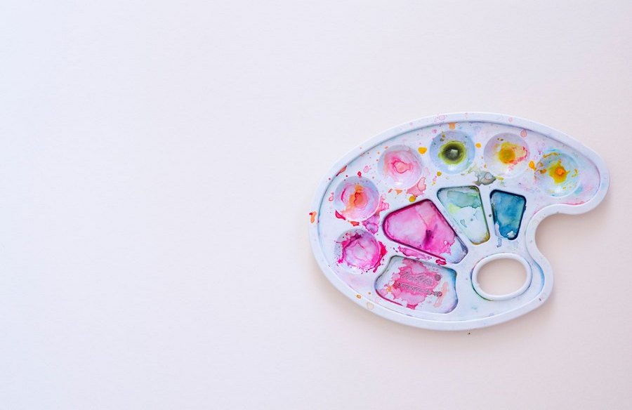
With so many different design trends, it is often tough to choose the perfect one for your design. Watercolors are perceived as childish, but what many fail to realize is the full potential of watercolors, even in today’s digital day and age.
The watercolor design trend incorporates - well, precisely that, watercolors. They are easy to learn but hard to master. However, nothing can stop you from trying to create unique new designs and graphics. They are fun, they provide that feeling of youth and childhood, they remind the viewers of the old days when everything was simple. All in all, they are a powerful tool in design, so perhaps it might be a smart decision to use exactly this trend when you make your next design.
Here are several places where you can employ the watercolor design seamlessly and effectively.
Digital Consumption - Blogs and Websites
If you’re a blogger writing about travel, food, fashion, or anything as colorful, you might want to look into watercolors as a design feature of your blog or website. As we’ve already mentioned, they are fun and exciting and bring a feeling of freedom to the table.
The blurred lines and seamless merger of colors resembles the ingredients forming one special, phenomenal dish. Watercolors are also generally soft, comfortable to look at, without bright colors and sharp edges. All this really does spark that ever-elusive feeling of youth, which in turn makes your readers’ stay at your website as pleasant as possible.
While we’re at the topic of digital arts, perhaps you could try using watercolors to make your logos look fresh, new, crafty, and hand made. The slight imperfections of such designs do feel like home to most users. In short, such designs are fun and easy and might be the decisive factor in bringing traffic to your website.
Business Cards, Book Covers, and Packaging
Imagine you are employed by a publishing company to design a cover for the new edition of “Peter Pan.” Perhaps you’re employed by a cereal manufacturer and need to make a new cereal box design. Both of these have one thing in common - they are both primarily consumed by children, and children are as tough of an audience as it gets. They will always choose what feels nearest to them. Why not then use watercolors to appeal to them?
Watercolors are something children are familiar with, they feel good, they look fun, especially if you succeed in making some fun designs using watercolors. Surely the company that would have employed you would be pleased with the sales going through the roof because you have made a smart choice going with something kinds know and love.
Business cards, on the other hand, are very serious and represent the rigidness of the business world in a unique way. Every once in awhile, it is really nice to have this seriousness broken, or at least diluted. Designing your business cards with watercolors may well be the one thing your clients remember about you in the sea of similar service providers. It’s a tough world out there, and anything that may distinguish you from the competitors is worth doing, or at the very least trying.
Clothes
So many companies have been established using the advantage of print-on-demand. People love wearing custom shirts, hoodies, etc. but on the other hand hate being the same as everybody else. Black text on a plain white shirt does convey a message but does not necessarily look nice or pleasing. This is where watercolors may come in handy. They are colorful and laid back, and can provide so many excellent designs that can be worn with pretty much everything and by everyone.
The hows, the dos, and don’ts
Let’s now discuss some of the technical bits that you may find useful. All these are basic design, but still, sometimes designers get carried away, so it’s always good to have a reminder. When using watercolors for your designs, use no more than three colors, otherwise, you risk making a huge smudge that doesn’t look really pleasing. Play with different shapes, shades of color, and shadows.
Because the very nature of watercolors is fluid and imperfect, don’t try forcing your designs to be perfect. This might prove to be too hard to do, while also being very counterproductive as nobody expects perfections from watercolors.
When it comes to the designing process, you have two options. We recommend going with the one you like the most and the one you’re the most comfortable with. Adobe Photoshop is a phenomenal tool and is perfectly suited for any designs, watercolors included. Make sure you choose adequate brushes and papers as the granulation of the paper can make a huge difference.
On the other hand, if you’re more familiar with real painting, enjoy it better and feel like you’re more productive with a brush in hand instead of a mouse, you can choose the paint and then afterward scan your designs. Make sure you use a wide variety of brushes. Depending on what you’re trying to achieve, you may sometimes want to use wider, and other times slimmer brushes. Experiment with strokes and taps and other painting techniques.
Once this all is settled, you know what you’re designing, you decide on the medium, whether digital or physical, and you choose your equipment, the only thing left to do is - paint. As is always the case with any art form, it’s always important to simply have fun. Try different things, research different methods, put yourself into a child’s shoes, and try to visualize the world through a child’s eyes. Blue or green, red or yellow, no matter the colors, simply let your hand loose on the paper and enjoy the end result.