Typography Tips for Beginners
Mon.25.10.2021 BY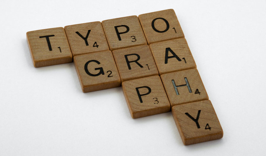
You've heard them all: serifs and sans-serifs. Blackletter and italic. Geometric and cursive. Typefaces can be tricky to choose and complex to master, and there's an endless supply of options to evaluate — we could be here all day. But don't worry — we've got your back!
You are about to learn all there is to know about choosing fonts based on both research and personal experience. The font is one of the most important features of any design. It can make or break your brand's image. Or imagine you writing some evergreen text and it’s not readable, how would you feel? So the most important thing is legibility.
You can evaluate legibility in 3 ways: 1) Readability - Is the text easy to read? 2) Scanability - Do you get drawn into the content? 3) Appeal - Is it well designed?
Legibility and readability
Legibility and readability are not the same things. The former helps us figure out whether a font is “legible” - something we can all agree on. The latter helps us figure out how readable a specific typeface is to a specific audience. Legibility It will help determine if people will buy the product or not by making the text on the package easy to read. When it comes to choosing an appropriate font, many things need to be taken into account. Foremost is the legibility of the text. The legible text should be one that is clear and easy to read, including any marketing materials that you develop. Here are some tips on picking the right font for your business needs. Most of these laws include minimum size hierarchies for text on packages, with legibility being associated with font choice, stroke weight, stroke contrast, character width and counter height.
Font weight and style
As you know it earlier font weight has more varieties from thin to bold and in the middle is a regular font which we use during writing this text. It depends on your goal which weight you will choose (you shouldn’t write headlines with a thin weight, but that doesn’t mean that bold is the best option for everything because it is not so comfortable for readers when you have a lot of text.)
Any designer would tell you that typography is important. The right typeface can make or break your posters, logos, and even the words you use when writing a message. Learning about typography can help you convey a better message to your audience.
What to choose: Serif or Sans Serif
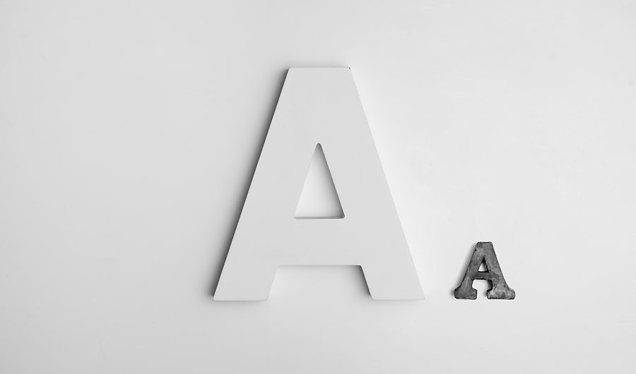
A line is a small stripe or stripe at the end of a large stroke at the bottom of a letter is called serif, Seriffed typeface has a more elegant and less harsh appearance. Serifs most commonly appear on older designs of typefaces. There are literally hundreds of different serif typefaces but only a few serif fonts that you will ever need to use. They can be used in any font-weight from regular to extremely bold. Georgia, Lucida and Times New Roman are some of the most popular Serif typefaces.
Sans Serif
Sans serif typefaces do not have serifs from the French word sans which means "without". Sans serif typefaces have eye-catching moments and are recognizable as modern, usually bold excellent for headlines. Arial represents the most popular sans serif typeface.
Font family
Choosing font family can be a hard task from system fonts (from Helvetica to Futura) to a web fonts (such as Gotham or Montserrat). Each font carries with itself some message to the world so every font is unique.
The biggest common mistake for most beginners in design when it comes to this subject is that many of them love to use more fonts. Here we can use the quote “more is not better”. So our advice is to limit the design to 2-3 fonts and you will see benefits really quick and if you were one of these designers follow the rule of pairing fonts. Try to choose similar fonts to avoid the mistake of using almost the same fonts or using totally different font styles.
If you reading for the first time post about typography don’t feel confused if you think there is a lot of stuff need to know. Feel free to experiment by following these steps and you will see awesome results.