Top 11 Most Expensive Logo Designs Ever
Tue.10.11.2020 BY
We’ve all had trouble finding the right amount to charge for our designs. Clients sometimes don’t know just how much effort goes into designing a perfect logo. Days of market and customer psychology research go into the design, and the clients usually can’t see any progress during that period. However, that doesn’t mean that the designer isn’t busy. That said, some designers have found a way to cash in big on their logo designs. Whether their creations were that good or the clients were just so happy with the designs, these designers have profited greatly from the logos. Here’s the list of the top 11 most expensive logos ever designed.
#11 City of Belfast
At number eleven, there is the logo design for the city of Belfast. Belfast officials changed the city’s logo in 2008, and they ended up spending $280,000 on the new design. The logo is a tilted heart, resembling the letter B, and has the city’s name written inside laid vertically. According to the City Council, the heart-shaped B stands for “be” as in “be welcome,” “be vibrant,” “be part of it,” while the heart represents love and conveys the message that Belfast has left its not-so-grandiose history in the past. The logo looks like magnets that are sold on the streets, which makes the design even more useful.
#10 City of Melbourne
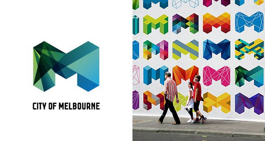
Home of the Australian Open and the second biggest city in the country, Melbourne was in need of rebranding in 2009. For the new logo, the city hired the company Landor. They came up with a $625,000 creation that very quickly became the symbol the city’s famous for. The stylized M, with its sharp lines and shades of green and blue, stands for the corporate power of the modern, vibrant city. The new logo was welcomed positively and still stands strong as one of the symbols of the city.
#9 London 2012 Olympics Logo
The first entries on the list were cities, but not only cities and companies are in need of branding. World events, such as the Olympics, need it too. When the city of London hosted the Olympics back in 2012, they paid $625,000 for the new logo. It was designed by the company Wolff Olins in 2007. The logo didn’t mee positive reviews, and the company was criticized as sloppy and unprofessional. Nonetheless, their design was chosen to represent London as the capital of sports for 2012.
#8 Pepsi
In 2008, Pepsi needed a logo redesign and logo redesign they got. As one of the biggest soft drink manufacturers, Pepsi paid $1,000,000 for the new logo. Even though it’s not too different compared to the old one, it was still a success - the company’s obviously happy with the new, more modern design. Their intention was to challenge Coca-Cola, and with the new logo, they’ve done a good job.
#7 CitiBank
CitiBank’s logo, designed over two decades ago, is still as relevant as it was when it first came out. An interesting thing about this logo is that it was the first one drawn out. It was sketched on a napkin, and after scrutiny, its more refined version became the final product. Its cost of $1,500,000 might seem a bit high, but it’s not that much for a bank, and because of what it does, you can be certain that CitiBank is very happy with its investment.
#6 BBC
BBC redesigned its logo in 1997. The rebranding campaign cost the company $1,800,000, but it’s well worth the price. The BBC logo is one of the most memorable logos in the television world. Their new logo comes in several color variants, but all of them look very familiar and are recognizable in every household.
#5 Australia & New Zealand Banking Group (ANZ)
Now we’re entering the big league. Multimillion-dollar logos are rare, but they still do exist. When the Australia & New Zealand Banking Group was in need of a rebranding, the total campaign ended up costing $15,000,000. While it’s true that not the entire sum was used only for the logo, as the campaign included an entirely new marketing strategy, a good portion certainly did go towards funding the new logo.
#4 Posten Norge
Norway Post’s new logo was unveiled to the public in 2008. As the state-owned company that has the sole right to deliver small, sub-50g packaged throughout Norway, you can only imagine the reach this company has. The logo redesign cost them $55,000,000, and while it does sound like a lot of money, with this move, the company has established itself on the market even more by successfully creating positive brand awareness.
#3 Accenture
Accenture is a global technology service, management consulting, and outsourcing company. In 2000, when the company needed a redesign, they ended up paying $100,000,000 for the new logo. While the logo looks simplistic, given that it’s in all lowercase with only a small accent above the letter “t,” it does an excellent job positioning the company on the market. Everyone in the field instantly recognized the logo when they see it.
#2 British Petroleum
Another company that decided to change its branding at the turn of the century was British Petroleum. Their new flower-shaped, green, yellow and white logo cost them a whopping $210,000,000. The idea behind the logo was to promote environmental awareness of the company in an unfavorable field of business. Unfortunately, the campaign was criticized by many as a gas company simply cannot be green, especially one that was to blame for one of the biggest oil spills in history.
#1 The undisputed king of expensive logos
By far, the most expensive logo ever paid for is Symantec’s new logo. It was so vastly expensive that it just could not be on the same list as all the other designs. The company’s marketing strategy cost the company an astounding $1,280,000,000. The key element of the logo is a black checkmark inside a yellow circle that indicates that the operation was successful. The yellow color also signifies continuity and stability of protection, which is vital for a company that provides website security. All these features combined convey safety, trust, and security.
Conclusion
While it’s true that a lot of work goes into a design, we can’t say that it’s justified to spend billions just for a logo. Still, it happened, and it has made some designers very happy.
However, not all good logos are expensive. Nike’s famous Swoosh had a cost of whopping $35, Twitter’s bird’s cost was $15, and Google’s, Microsofts, and even Coca-Cola’s famous logo designs set the companies back exactly - nothing. It’s an art in itself, figuring what to charge for your designs, and as with every other art, some artists are simply better than the others.
