Material Design vs. Flat Design: How They Compare
Sat.12.09.2020 BY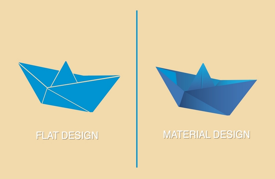
These two design languages are so similar to each other that we fully understand why someone would be confused regarding the difference between them. They are, however, not the same, and the difference, however subtle, does indeed exist. Let’s first discuss each of them individually, and then at the end, see how they compare.
What is Material Design?
Material design is a design language shaped and framed by Google. In their effort to uniform the UI design on all of their platforms, Google has stepped up and created Material design precisely for this intention.
Google has created Material design to resemble and replace physical pen and paper in a digital environment. In the guidelines and principles of the Material design’s use, Google prescribes a grid-based structure with various animations. The UI that you can create with Material design is extremely flexible, responsive, and easy to use, to the point that it almost does feel as natural as paper.
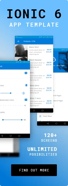
One of the most prominent features that distinguishes Material design from Flat design is precisely the fact that Material design tries to mimic paper. That comes with a consequence of shadow. Materials, such as paper, cast shadow, and Google’s Material design embraces shadows fully. Material design is, therefore, a 3D language as it has the ability to create the illusion of depth.
If you decide to create a design for, say, your app, using Material design, you will find it very easy to add animations to your designs. Also, because everything is as well-structured by Google, the design is bound to be extremely intuitive, and users will be familiar with the app immediately upon seeing it for the first time.
On the other hand, if you try to create something new and fun, you might find the Material design quite claustrophobic and confining. Precisely because everything is so well-defined, you, as a designer, are left with very little room to create something new. Also, you’ll need to be careful with animations. While they do look nice and fun, they also consume quite a lot of battery power, which your users might not appreciate tremendously.
What is Flat Design?
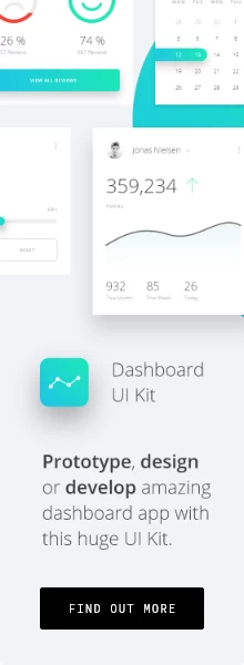
On the other hand, Flat design does not follow any strict guidelines. Its development wasn’t influenced by a company, but rather by evolution and design trends. The main feature of Flat design is the interaction between colors, shapes, icons, typography, and animations. Unlike Material design that embraces shadows, Flat design denounces them, or any form of 3D design for that matter. Flat design is, well, flat. Everything is in line with each other, and nothing sticks out.
By ensuring that nothing “protrudes” and that everything is flush and in line with everything else, designers can produce a sleek, clean, uniform look. It also comes with a side effect of reducing loading times and battery consumption of devices it runs on. In today’s day and age, people value time more than looks, which is why Flat design can come in handy. The flat design ensures that your designs will be clean, minimalistic, and look nice. Because it fundamentally lacks clutter, any font you use will be highly readable and look good.
On the downside, Flat design may feel hard to create something entirely new, precisely because of the simplicity. You won’t be able to create the illusion of depth, which means that your buttons will not “look” clickable. In mobile UI development, buttons need to be as easy to notice as possible, and without it popping up from the background, it may seem challenging to notice it at first glance.
Also, for some of you who are less free-minded and who prefer to follow guidelines and structure, the complete freedom of Flat design may be too much. With so many options at your disposal, you may find yourself roaming aimlessly, trying to find the best option for your designs.
There is also one other thing that you should be aware of. Unlike Flat design, Material design is designed by, and by extension, completely inseparable from Google. If you are creating a design native to some other platform without the intention of crossing into the Google realm, you can break free from the rules imposed by the company and step into the world of complete freedom.
Which one should you use?
Well, just like everything else, the question is what you are building and how creative you feel yourself to be. If you’re creating and new Android application and want your users to know what they are doing and how to use your app as soon as you release it to them, then you might want to go with Material design. With so many distinct design features, you really do have the ability to create stunning designs.
With shadows and 3D depth effects, overlays, animations, flows, and whatnot, you can create beautiful designs that feel natural but still modern and up to date.
If, on the other hand, you choose to go with something entirely new, or are creating the next big thing in the tech world, something that we’re not yet familiar with, then you can go with Flat design for your design language. With it, you can still create gorgeous visuals, and you’ll be free to do whatever you want. You won’t be constrained with any guidelines and principles, and you’ll be able to create your next big thing. Also, you’ll be able to do so in such a way that your users will appreciate, as your design will consume less of their precious battery power.
Finally, as with almost everything else in the design world, there is no definitive answer as to which one is better. They both have their uses, and it clearly depends on the project you’re working on and the end-users of the design. No matter which design language you choose, if you have a clear picture of what you are trying to design, and if you end up creating a fluent, intuitive, and easy-to-use UI, the majority of your uses will appreciate your design.