Top 12 Graphic Design Trends To Expect In 2019
Fri.30.11.2018 BY
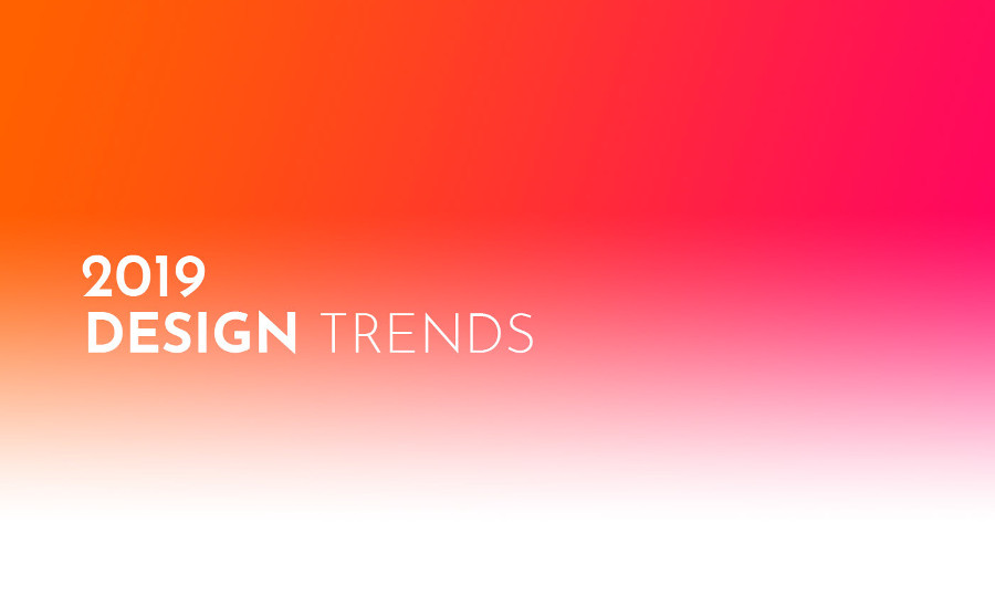
This year is almost over, so it's time to start thinking about the graphic design trends for 2019. New graphic design trends emerge not only by experimenting with innovative ideas, but also via adjusting the designs with the needs of the ever-changing digital world. Let's have a look at the graphic design trends that will be prominent in 2019.
#1 Gradients & Duotones
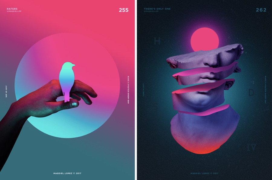
When Instagram changed its logo into a colorful gradient, nobody could predict this trend was going to become so huge. Gradients, which are also called color transitions, will be at the top of its game in 2019. Considering the fact that designers are using a more varied approach to color and transitions, it is likely that gradients will see a slight makeover in how and when they are used. Duotone graphics were quite popular several decades ago. They began their comeback in 2018, and will surely continue to rule in 2019. The two-toned colors are a quick way to grab attention and remain hard to overlook.
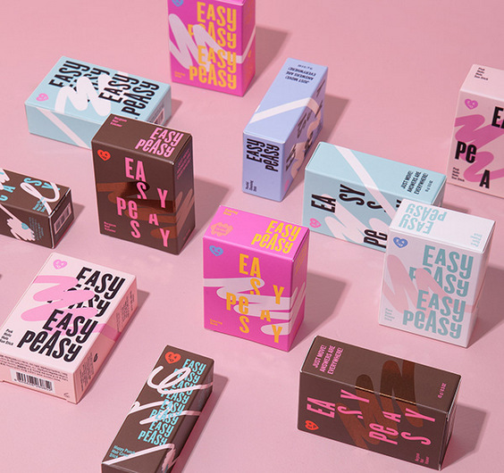
#2 Hand-Drawn Text & Illustrations
With so many graphic design trends fighting for the leading positions in 2019, hand-drawn graphics are surely on the top of the list. There is a huge push for authencity and originality in the world of graphics, and hand-drawn graphics offer plenty of both. Hand-drawn illustrations are becoming increasingly popular due to the latest innovative tools such as digital pens and stylus that can be used on touchscreen tablets and laptops.
#3 Gallactic Effects
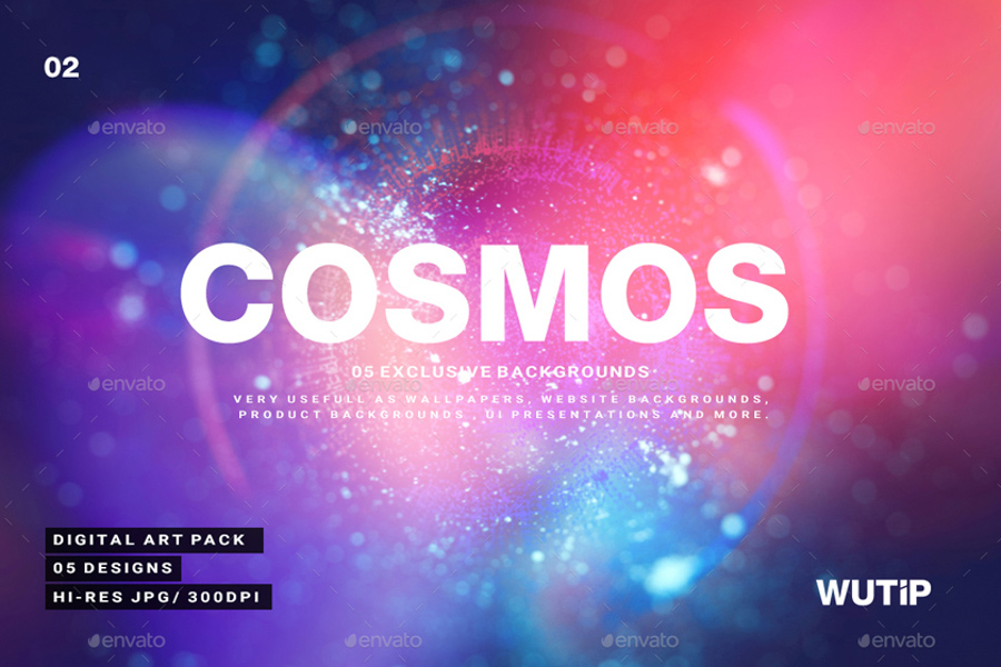
2019 will be the year of the galactic effect, which comes as no surprise considering the fact that space travel and planetary discoveries have been making headlines throughout 2018. Prepare yourself for bright colors, starbursts, laser-sharp lines, shimmering space dust and other cosmic themes. Along with the galactic trend, there is a huge possibility that the use of electric colors like purple and blue will skyrocket. These deep colors resonate well with the modern audience and appear brighter on devices that offer rich colors and high display capabilities.
#4 Wave effect
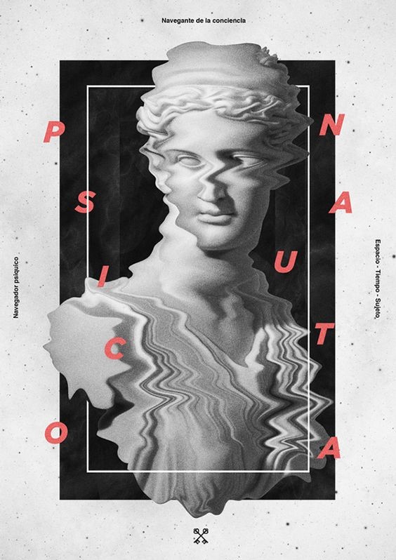
Wave effect trend emerged this year, and has firmly established its position. Via this interesting effect, the image is served as it is damaged. What was once considered annoying for the spectator, has now been turned into a truly wanted effect.
#5 Colored fonts
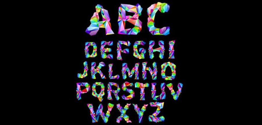
The days when fonts were limited only to the ones available digitally are long gone. Designers today are coming up with more creative and colorful ways to write the text in artworks. In 2019, we will see a rise in vector fonts with multiple colorful elements.
#6 Mono-color
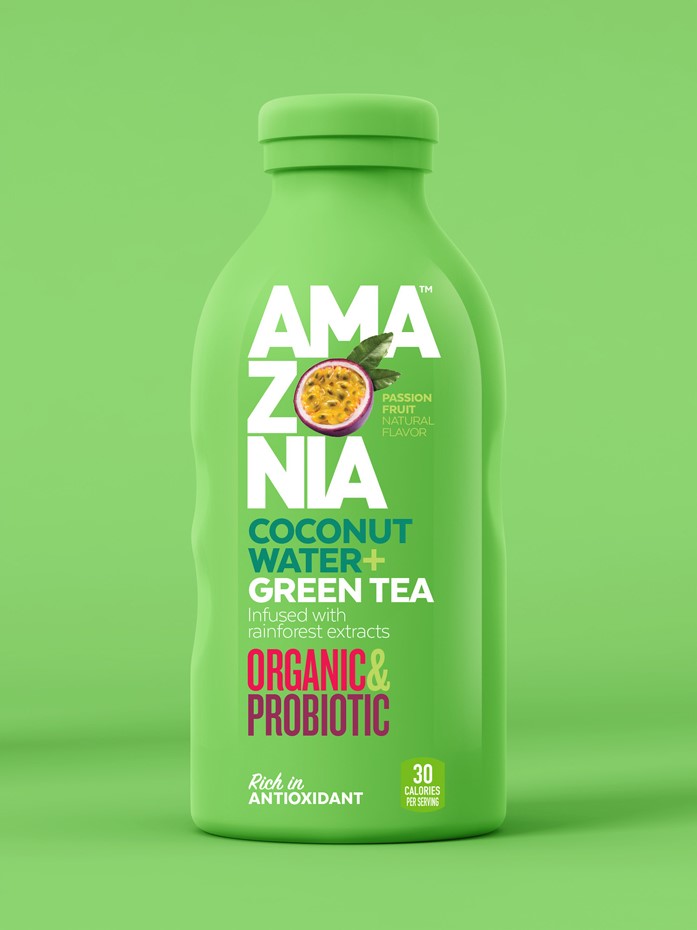
You have probably noticed a lot of posters on which the background color and the color of goods coincide. The advertised subject stands out thanks to the 3D technologies, which create the feel that the object smoothly emerges from nowhere. Mono-color is a great graphic design technique to motivate the audience to look closely and pay attention to your product.
#7 3D
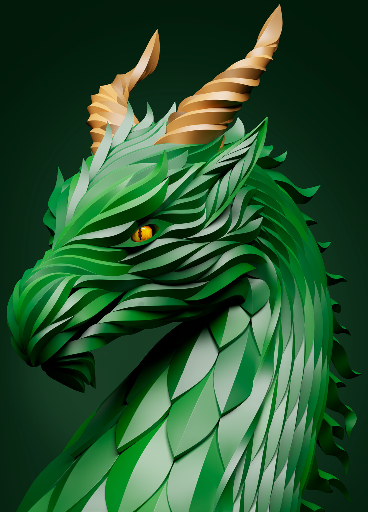 3D has proved itself as a quite persistent and stable trend in the last few years. Technologies are evolving quickly allowing graphic designers to create amazing 3D pieces of art which allow the viewer to immerse into the design.
#8 GIFs
GIFs are a slightly animated images that play like a video within a loop. Their biggest advantage is that they look animated, but their file size is significantly less, which makes them suitable for sharing over the internet. In 2019, we will see much more of such graphics.
#9 Asymmetry
The first thing that comes to mind when we hear the word "asymmetry" is the lack of balance. However, asymmetry in graphic design is much more. In 2019, designers will use surprising perspectives and asymmetry to bring a new lease of life to the digital scene.
#10 Metallic colors
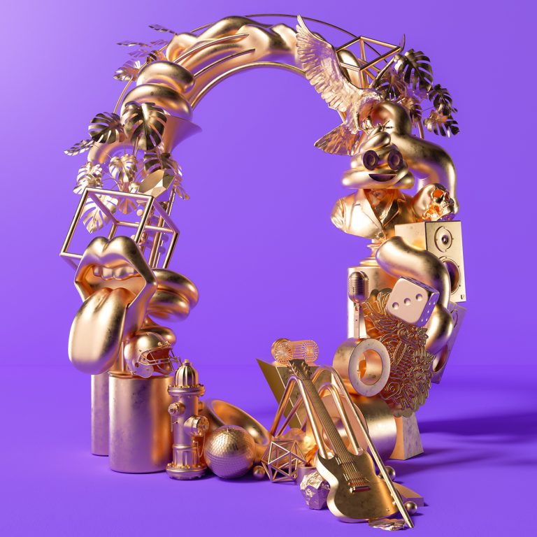
Metallic colors entered the world of graphic design to create the "Wow" effect. Thanks to correlating trends like gradients and galactic effects, metallics have a clear path to make a huge comeback. Considering the fact that modern printers are able to adequately transfer these unique effects onto paper or another materials, there is no more obstacles in implementing this trend.
#11 Augmented reality
There is a plethora of opportunities for designers and brands to explore the possibilities of augmented reality (AR). Tech giants such as Google, Apple and Microsoft have started to experiment with AR, and this technology will definitely shine in 2019.
#12 Modern Collage
We have already witnessed the emerge of some modern collages combining elements of the real world with illustration. Although collage is not a new concept, it will definitely become even more prominent in 2019. In terms of graphic design, we have so much to expect in the coming year. Besides articles like this one, you can always check out websites like Dribbble and Behance to stay up to date with the latest developments in the world of graphic design. What are you looking most forward to in terms of graphic design in 2019?