RGB vs. CMYK: Breaking Down the Difference
Tue.06.10.2020 BY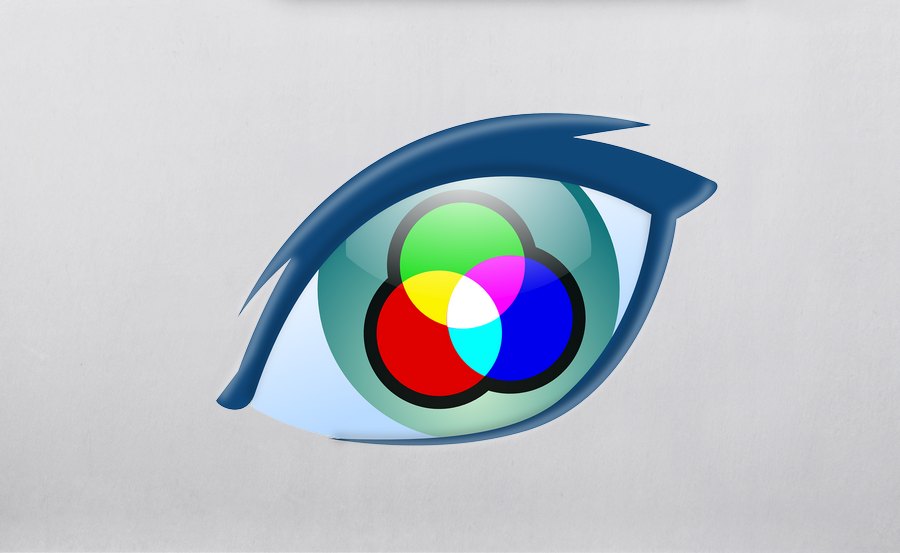
If you’ve never dealt with graphic design, then perhaps you have never thought about how colors get displayed. There is a whole science beneath colors, different wavelengths, etc. However, what we’re interested in is the designer’s perspective. This article will go over the differences between the two most widely used color modes, RGB and CMYK, explain what each of them is and what each of them is best suited to be used for.
What is RGB?
Let’s first start with RGB. As you’ve probably guessed, RGB is an acronym that stands for “Red, Green, Blue.”
We’ll preface this section by saying that your designs meant to be used on digital media should be made using the RGB color mode. But why, you may ask. Let us explain.
Today’s technology is highly visual. You’re reading this post on a digital display, probably a computer monitor or a phone display. LED displays, for instance, has its pixels made of, well, Light Emitting Diodes (LEDs). Each pixel consists of three diodes, one red, one green, and one blue. When the computer sends information to the display about the image that needs to be displayed, the diodes inside each pixel fire up just the right amount. By mixing different values of light coming from each diode (brighter red and dimmer blue, for instance), the display can portray any color you may want.
RGB color mode in design should, then, be used when you’re designing content intended to be viewed of displays that naturally produce colors using RGB diodes. When designing using the RGB color mode, designers can manipulate things like saturation, vibrancy, and shading by modifying any of the three source colors.
You can also think of RGB color mode by referring to red, green, and blue as additive colors. RGB color mode, therefore, creates other colors/shades of colors by adding different amounts of red, green, and blue to the same mix. The higher the amount of base colors, the brighter the image gets.
RGB color mode should be used specifically when you design web applications and websites, image posts for social media, and any other visual content intended for digital consumption.
What is CMYK?
Not everything nowadays is intended for digital use, though. On the other hand, CMYK, which stands for “Cyan, Magenta, Yellow, Key/Black,” is a color mode that is meant to be used for printing.
Unlike RGB, which is an additive process, CMYK is a subtractive one. As you can imagine, this is a completely opposite process compared to RGB. It also makes sense - when you’re printing a design onto paper, for example, you start with a white background, and you remove light by adding color. The more color you add, the darker the image gets.
CMYK color mode should be used when creating designs for printing purposes, no matter what they may be. Some specific instances would be designing, for example, business cards, stickers, posters, billboards, t-shirts, anything that is meant to exist in the physical rather than the digital world.
Conclusion
Both RBG and CMYK color modes have their uses in modern graphic design. Unlike many other polarities, RGB vs. CMYK isn’t a matter of whether one is better than the other, as the importance is placed on what the intended use of the design is. To recap once again, if your design is meant to be used in the digital sphere, i.e., viewed on a display, then make sure to set your Photoshop to use an RGB color palette.
On the other hand, if you’re designing something that is meant for printing, opt for the CMYK color mode. This way, your designs will look just like you envisioned them once you put them on their media.