5 Biggest UX Mistakes in Mobile App Designs
Thu.22.10.2020 BY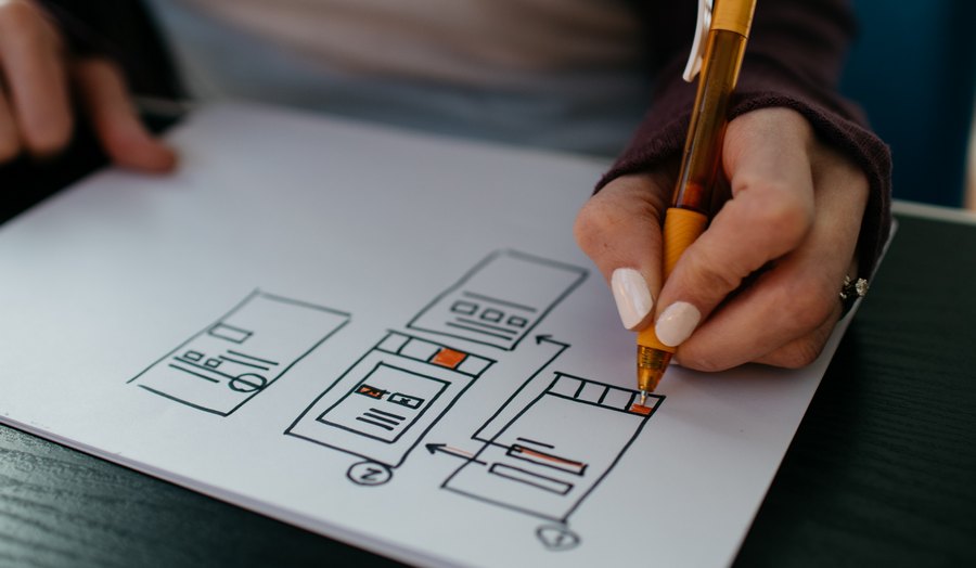
Creating a good UX for a brand-new app isn’t exactly an easy endeavor. There are so many things to take into account, and all of them directly impact the conversion rate, making or breaking the app. If you’re building a new app, you must make sure that the users know what to expect and how to use the app, even before you deliver it. In today’s market, where the PlayStore and AppStore are both overcrowded with apps, you have to do everything in your power to stand out, and a good UX can only help you with that. This post will go over some frequent mistakes that UX designers tend to make when designing a new mobile app.
#1 Neglecting architecture
Let’s start with the foundational mistake. When building a brand-new app, you have to foresee how the app will be used. UX designers must create a valid flow through the app, otherwise, it might be too hard to navigate. This is a crucial step. So, to create good architecture for your app, start from the bottom up. Think of the first page your users will see. Think of all the other screens. Connect them, test and try different concepts, make sure that your design holds even when used by a person who is completely disconnected from the app. If your fundamental architecture is good, and your app ends up solving the problem it claims to solve, other mistakes become much easier to forgive.
#2 Creating too many features
It’s easy to fall into the trap of creating multiple unrelated or barely related features and putting them side by side inside the app. But, once again, think from a user’s perspective. Too many features from the get-go can overwhelm the users. This can be confusing, and if they’re using the app for the first time, they might search for an alternative.
Instead, focus on refining the core feature that your app provides. Put the emphasis on it, refine it, make it work flawlessly from both design and functionality perspectives. Only then should you think of expanding the app with other features. Remember, your product will be relevant only if it solves a real problem a user has. It’s simple then - focus on one problem at a time.
#3 Custom icons and buttons
We do understand that this means taking some of the creative liberty away from designers, but, on the other hand, how can you be sure that your users will know what the icon is? You’re familiar with the “share” button icon, the three connected dots. This is a simple, effective icon that all the users know. If you, for whatever reason, choose to redesign the “share” button, be sure that you’ll create a lot of confusion in the process as well because your design will likely be completely different from what the users already know. This ties up nicely to another point - your app should have little to no of a learning curve. In order to attract and keep users, your app must be easy to use. The best way to secure the ease of use is to create a design that feels familiar. If your users don’t think of the design and simply use it, then you can be sure that you’ve done a good job. The less thinking - the better.
#4 Poor onboarding experience
Sometimes, however, you do end up creating a completely new solution to a problem people didn’t even know they had. This is a golden ticket if done correctly. But be careful - you’re creating something new, something unfamiliar, and if you want the users to use your product, you’ll have to teach them how to do it best. Creating a good tutorial can be tricky - you want to teach your users about the app, but not to push too much information on them immediately. It is your responsibility to, as a UX designer, guide your users through the app, to teach them to use first the core functionality and then all the rest.
Depending on the app, it might even be a good idea to leave some features to the users to discover. If you’ve done a good job, and if you’ve succeeded in retaining your users, then they will probably explore the app beyond the tutorial. This can even be a sign for you - if the users manage to find some “hidden” features or easter eggs, that means that you’ve done a good job, and they’re using the app as intended.
#5 Ignoring feedback
This is perhaps the worst mistake of all that you could make. Sometimes designers fall into the trap of feeling that they know what’s best for their design. Pushing the design onto the users at any cost is not only detrimental but can completely break the product. Remember that, even though you’re the one who’s designing the app, the users are the most relevant ones as only they can know whether something needs overhauling or not.
A good UX designer will always take into account a user’s feedback. Some designs might look good on paper but don’t translate well into the app. When this happens, the designers are usually oblivious as they’re the ones who implemented such a design. Users’ input is gold in such situations. Being humble and acknowledging that you’re not perfect is the best way to move forward yourself as a designer and your app.
Conclusion
The outlined five mistakes are the most crucial ones when developing a mobile app, and if you avoid them, you’re already on the path to success. Remember - designers design, users actually use. Making the app as comfortable for users, without cluttering it with irrelevant features and designs, is the way to go. If you do that, and also take advantage of invaluable user feedback, you’re bound to create the next big thing on both the PlayStore and the AppStore.